The Real Interior Trends for 2022
At this time of year whenever I read a “What’s new for interiors in…” article I can predict it will say exactly the same things that it has for the past 3 to 5 years.
You can guarantee the word Biophilic (design connecting us to the natural environment) will be in there somewhere. You can predict something around sustainability. Usually something about neutrals (ground breaking), and a colour thrown in there for a point of difference from last year, typically green.
To be fair, many of these predictions will likely come to pass, principally because they are already themes that sit very much at the core of interior design, furniture design and architecture today. I’d safely put all of the above in a “what we won’t be over in 2022 or anytime soon” category.
Of course what’s harder to predict is what will actually be new in 2022 because these are the things that are difficult to spot before they crop up.
Regardless that’s what I’ll try and do here, and whilst some things may not come to pass hopefully it will at least be a more interesting read. And what I’ll add to the list is things that I can imagine fading out during 2022 because, after all, we’re a fickle bunch.
Internal Windows
Perhaps not one for if you’re planning a simple repaint but for those building new spaces or undertaking more significant renovations I see internal windows cropping up more and more regularly in design.
Always a great way to allow light from our lightest rooms into darker spaces, they’re also increasingly another way to add a point of interest with a unique style as in the image above or just as an unexpected twist in a spot you wouldn’t expect. I anticipate seeing more of them as people move away from full open plan to more broken plan schemes which incorporate cooking, living and working spaces.
More thoughtful lighting plans
A great part of being brought into a project early as an interior designer is that you still have enough time to impact lighting plans and avoid the dreaded builder solution of a runway-style bank of downlights everywhere you look.
There’s also a move away from the “big light” that is such a staple of most houses in the UK, the large central fitting which is the default solution for lighting the room but can make you feel like you’re under interrogation if you turn it on at night to read your magazine.
For anyone at the point of considering a lighting plan, think carefully about alternative or additional fittings that can add light or a point of interest just where you need it. A small but beautiful pendant on a dimmer over your favourite chair, a single wall light where you most often use your laptop, offset fittings over an island to highlight a seating area or create an unexpected offbeat feel.
The right blue
Ok so I said I wouldn’t include a random colour, but I couldn’t resist.
Over the last few years we’ve seen a lot of navy, Stiffkey and Hague Blue everywhere you look, and particularly in kitchen design. But this year I’m falling for a mid-blue after seeing Lucy Williams using Farrow & Ball archive colour Yonder in her new house. There’s something classic and refreshing about the perfect mid-blue that has real style. I love it with a contrasting red and if I had the energy I’d repaint our bathroom, maybe if 2022 gives us a bit of a break. The blue on the kitchen above is Little Greene Air Force Blue which is another brilliant shade and made this blue kitchen stand out from the crowd.
Not Just Quartz
I’ve designed a lot of kitchens over the last few years and I would estimate that around 75 per cent of them have included a quartz worktop. There’s a good reason for this; quartz has got the beauty of a natural stone like marble but better durability and also more options in terms of colour and finish.
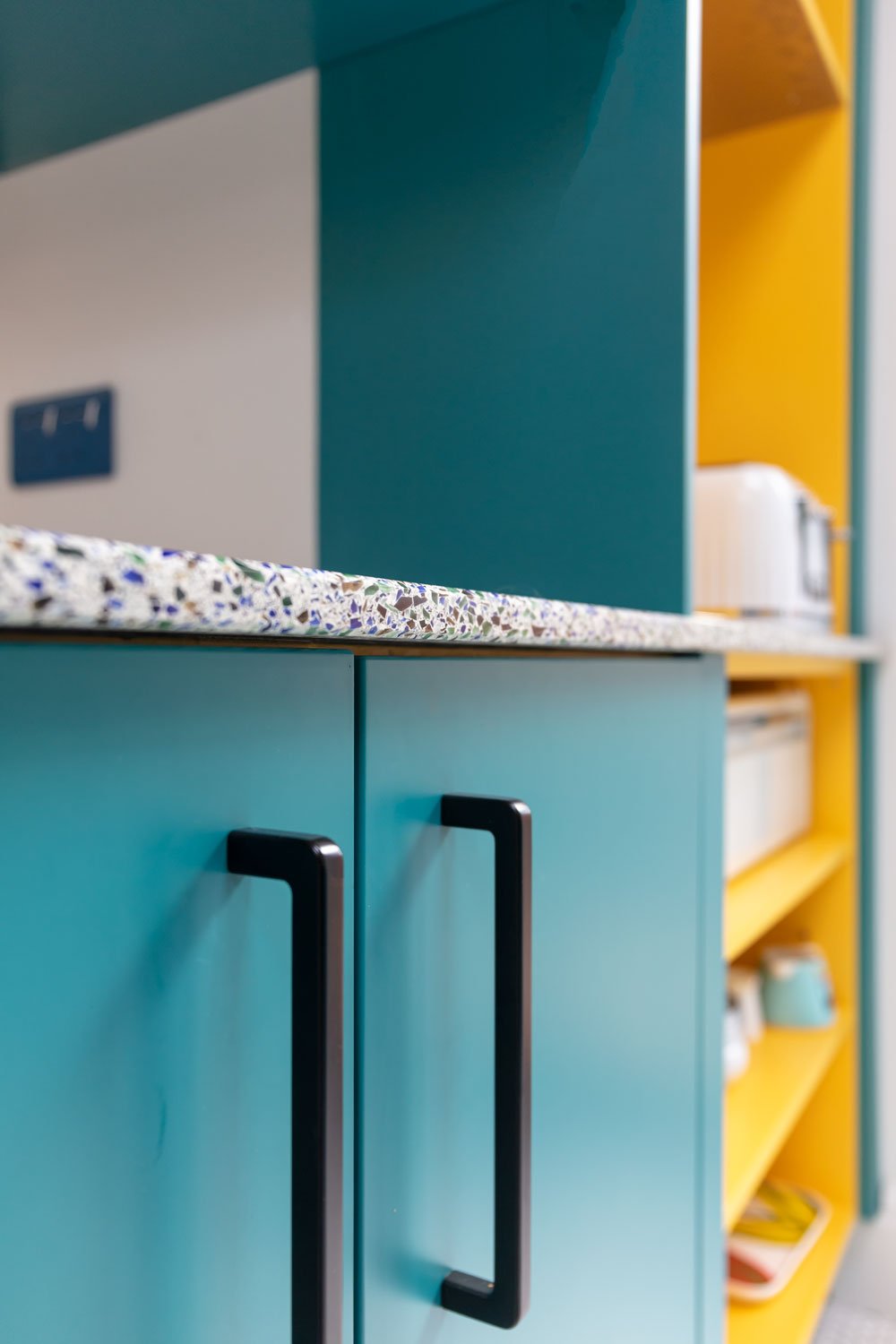
I still love a beautiful quartz finish but I see this becoming less of a default option in 2022. Many people are still steering away from wood because of the water issue (although I still love it myself) but other finishes including stainless steel, terrazzo and a host of recycled options including recycled glass (shown below), plastic and marble.
I’m looking forward to specifying some of these more sustainable and still beautiful options in upcoming designs.
Don’t Forget the Ceiling (and woodwork)
As well as more thoughtful lighting plans I think people are becoming much more aware of the fifth wall in their room and no longer simply defaulting to a white ceiling.
In a recent project I suggested painting the whole of a hallway in Farrow & Ball Mizzle including the ceiling and, whilst the client needed a little convincing, the all over colour provides a great backdrop to the elements that we wanted to stand out, including the orange door and vintage artwork. Equally you might highlight the ceiling in a different colour or even in wallpaper to add an extra dimension to a room.
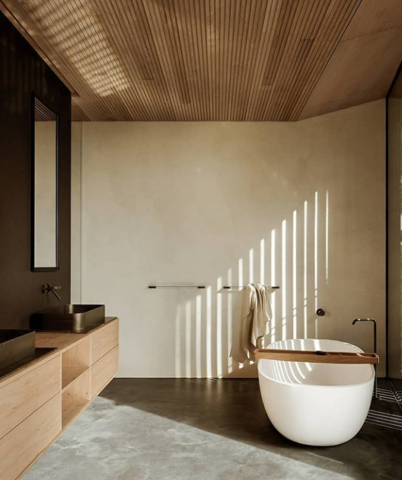
If you’re undertaking something a little more than a repaint you can take this a step further with detailing such as wooden panelling as in the image below.
I also find that some clients still find the concept of woodwork in anything but white a bit unsettling but it’s a scheme I rarely use today. I love to either highlight interesting woodwork in an unexpected shade or, if it is unremarkable, to paint it the same as the walls to give a finish that extends the wall height by not cutting it up into sections.
Image: @est_living


